Solution retrospective
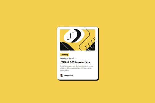
I'm happy that I used semantic HTML5 in my solution whether I'm not a 100% sure that I used it at the best. Moreover, I learnt that the max-width css property can have fit-content value which can be useful for my future projects. Maybe next time it would be nice to try out the mobile design first approach.
What challenges did you encounter, and how did you overcome them?I didn't know how to make the learning category tag's background properly. After research on the internet I found the fit-content value.
What specific areas of your project would you like help with?I used semantic HTML5 markup, however I'm not sure in my solution. Would it be better to include the blog-image in the content section?
Please log in to post a comment
Log in with GitHubCommunity feedback
No feedback yet. Be the first to give feedback on Csaba Hell's solution.
Join our Discord community
Join thousands of Frontend Mentor community members taking the challenges, sharing resources, helping each other, and chatting about all things front-end!
Join our Discord