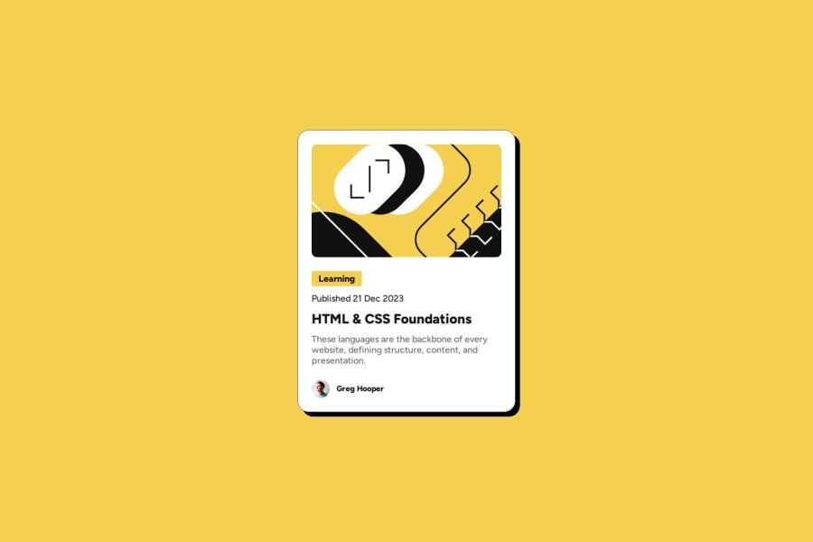
Design comparison
Solution retrospective
I am most proud of becoming comfortable using Flexbox, which has greatly improved my layout skills. Additionally, I learned some important concepts like media queries and hover effects.
What challenges did you encounter, and how did you overcome them?I didn't struggle with this project, and everything went smoothly. I was able to efficiently implement and troubleshoot minor issues as they arose, which contributed to a successful outcome.
What specific areas of your project would you like help with?I would like feedback on whether I should have used Flexbox on the .content div as well, considering that I was able to achieve my goal without it anyway. Additionally, I would appreciate any other feedback on my code.
Community feedback
- @flaviocmbPosted 7 months ago
Hello @anamaydev
Well done! Looks nice. Don't forget the mouse hover over the card and also try to use rem/em units all over your project. This is how your project looks on large font-sizes.
Question: I would like feedback on whether I should have used Flexbox on the .content div as well, considering that I was able to achieve my goal without it anyway.
I’m with you on this. I wouldn’t use it until it’s really needed.
Marked as helpful1P@anamaydevPosted 7 months agoHey @flaviocmb thanks for the feedback! As you suggested, I’ve added the hover effect on the card, and it looks much cooler now. Also, thanks for pointing out the issue with the larger font. I’ll make sure to use responsive units in future projects.
1
Please log in to post a comment
Log in with GitHubJoin our Discord community
Join thousands of Frontend Mentor community members taking the challenges, sharing resources, helping each other, and chatting about all things front-end!
Join our Discord
