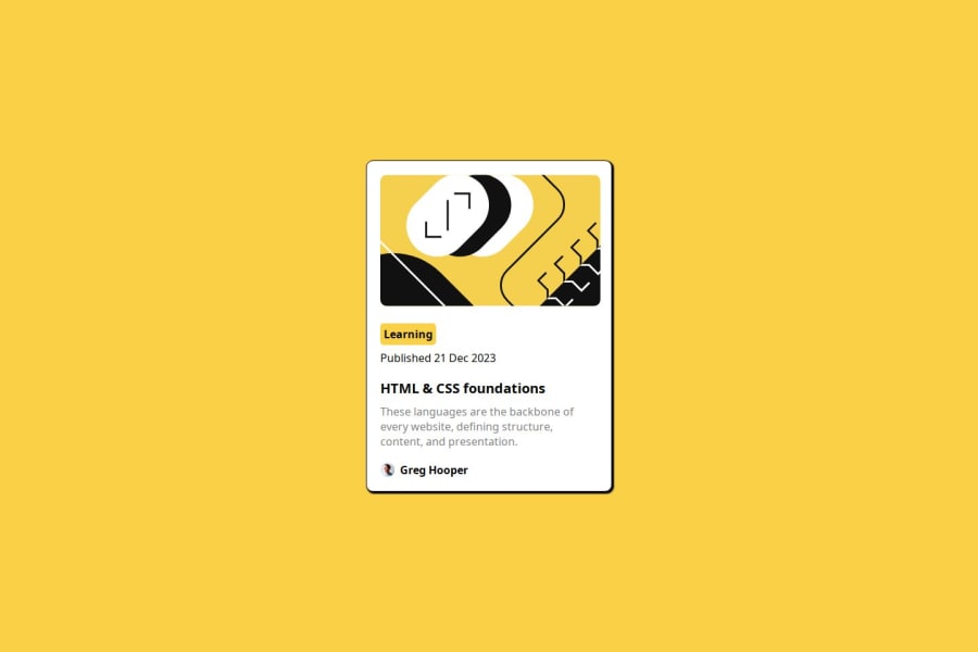


Design comparison

Solution retrospective
For the blog card preview project, you might be proud of how you effectively implemented the design using HTML and CSS to create visually appealing blog card previews. You may have successfully utilized flexbox or grid layout techniques to structure the content and make it responsive across different screen sizes. Additionally, you might have achieved consistency in styling, such as font choices, colors, and spacing, to enhance the overall aesthetic of the blog cards.
Looking ahead, you could consider exploring more advanced CSS features or frameworks to further enhance the design and functionality of the blog cards. For example, you might experiment with animations or transitions to add more interactivity to the cards. Additionally, you could focus on optimizing the code for better performance and readability, such as by organizing CSS rules more efficiently or using preprocessors like Sass.
Overall, reflecting on your achievements and considering areas for improvement can help you continue to grow as a developer and refine your skills in future projects.
What challenges did you encounter, and how did you overcome them?During the blog card preview project, you may have encountered various challenges, such as:
Layout Design: Designing the layout of the blog cards to meet the desired specifications could have been challenging, especially ensuring responsiveness across different screen sizes. Styling Consistency: Maintaining consistency in styling elements like fonts, colors, and spacing across the blog cards might have required attention to detail and careful implementation. Cross-browser Compatibility: Ensuring that the blog cards display correctly across different web browsers could have posed a challenge, as browsers may interpret CSS rules differently. To overcome these challenges, you might have:
Utilized CSS Frameworks: Leveraging CSS frameworks like Bootstrap or Tailwind CSS could have simplified the layout design process and helped ensure responsiveness. Used Flexbox and Grid: Employing Flexbox and Grid layout techniques in CSS could have facilitated the creation of flexible and responsive layouts for the blog cards. Tested Across Browsers: Conducting thorough testing across multiple web browsers and devices to identify and address any compatibility issues could have helped ensure a consistent user experience. Refactored Code: Regularly refactoring and optimizing your CSS and HTML codebase could have improved maintainability and performance, making it easier to manage and update the blog card project in the future. By tackling these challenges and employing effective strategies to address them, you were able to successfully complete the blog card preview project and gain valuable experience in web development.
What specific areas of your project would you like help with?To provide specific assistance, it would be helpful to know more about the areas of your project where you're facing challenges or seeking guidance. Here are some common areas where developers often seek help:
Layout and Design: If you're struggling with creating or refining the layout and design of your project, including responsiveness across different devices, we can focus on providing guidance on CSS layout techniques, such as Flexbox and Grid. Styling and CSS: If you need help with styling elements like fonts, colors, spacing, or achieving specific design effects, we can provide tips and best practices for CSS styling. JavaScript Functionality: If your project involves JavaScript interactivity, such as handling user input, DOM manipulation, or implementing specific features, we can assist with JavaScript code snippets, debugging, or recommending libraries and frameworks. Performance Optimization: If you're concerned about the performance of your project, including page load times or rendering efficiency, we can offer advice on optimizing your code, reducing unnecessary requests, or implementing lazy loading techniques. Debugging and Troubleshooting: If you've encountered errors or unexpected behavior in your project and need help debugging or troubleshooting, we can provide guidance on identifying and resolving issues in your code. Deployment and Hosting: If you're unsure about deploying your project to a web server or hosting platform, we can offer assistance with deployment strategies, setting up hosting environments, or configuring domain settings. Please let me know which specific area you'd like help with, or if there's any other aspect of your project you'd like to focus on!
Community feedback
Please log in to post a comment
Log in with GitHub
Join our Discord community
Join thousands of Frontend Mentor community members taking the challenges, sharing resources, helping each other, and chatting about all things front-end!
Join our Discord