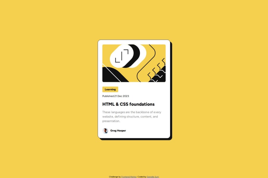
Design comparison
SolutionDesign
Solution retrospective
What are you most proud of, and what would you do differently next time?
i'm happy with how the hover state turned out
What challenges did you encounter, and how did you overcome them?challenges:
- i didn't exactly know how to do the transition for the hover state before doing the challenge, but it wasn't too hard to figure out. i think i did it well, but if you see anything that needs to be improved on let me know please!
help:
- i would like to know how i could get the hover state of the blog card to activate only when i hover over the h2 title
- i noticed that the image is slightly cut off on the mobile version, so i thought something like a mask over the image that shrinks when the screen size shrinks would be the solution, the only thing was that i didn't really know how to implement that, if anybody could help me out with this i'd greatly appreciate it!
Community feedback
- @zacc-anyonaPosted about 1 year ago
Hello Danielle, You have done a really great job in taking your time to finish this challenge. But there are a few areas you can improve on.
- You don't have to use multiple media queries for such a project. Using a mobile-first workflow will help you escape the hell of multiple media queries. What I'm saying? HTML elements are naturally responsive, so you could start out by reducing the size of the browser window to resemble the size of a mobile screen. Then code out the HTML elements to conform with the mobile design. Then later on you can use one
min-widthmedia query to complete the desktop design. This post on media queries will help.. - Always use modern CSS reset. It will help you with the image shrinking issue. This article will get you up to speed with the latest modern CSS reset..
Generally you have done a great job. If you find my comment helpful don't forget to mark it as helpful and give me an upvote.
Marked as helpful1 - You don't have to use multiple media queries for such a project. Using a mobile-first workflow will help you escape the hell of multiple media queries. What I'm saying? HTML elements are naturally responsive, so you could start out by reducing the size of the browser window to resemble the size of a mobile screen. Then code out the HTML elements to conform with the mobile design. Then later on you can use one
Please log in to post a comment
Log in with GitHubJoin our Discord community
Join thousands of Frontend Mentor community members taking the challenges, sharing resources, helping each other, and chatting about all things front-end!
Join our Discord
