


yahappylemon• 150
@yahappylemon
Posted
Here are just some ideas, hope you find them helpful!
- Add
*{margin: 0; padding: 0; box-sizing: border-box;}: Reset CSS and have a better control on all the elements. - Use
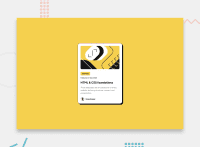
max-widthinstead ofwidthon.preview-card: Let the component grow and shrink according to the screen size. - Add
max-width: 100%to.top-imageand removemargin: contain the image in the card component. - Adjust margin and padding
- Remove
margin: 0% 5%, addmargin-top: 24pxon.label - Remove
padding: 0% 5%on<h1>,<h5>,<p> - Add
margin: 12px 0on<h5> - Add
margin: 12px 0 24px 0on<p>.
This is a peer review required by Frontend Mentor
0
ِAhmed• 280
@Axsel519
Posted
@yahappylemon Thank you for the advice ❤️
0
