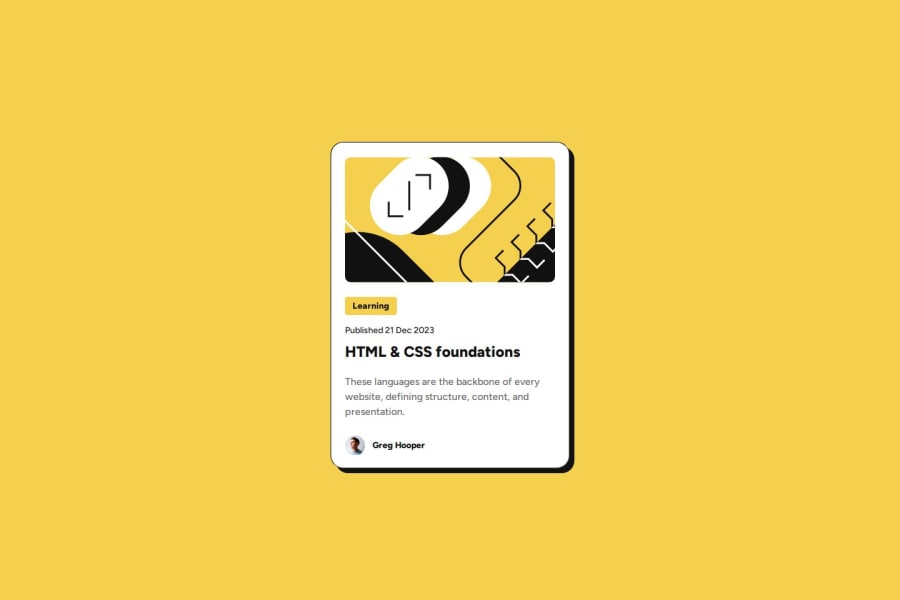
Blog preview card


Design comparison

Solution retrospective
Hello, Frontend Mentor community! This is my solution to the Blog preview card.
The solution was made with semantic HTML and CSS using the desktop-first approach.
I am happy to hear any feedback and suggestions!
Community feedback
- @BlackpachamamePosted about 1 month ago
Your project looks correct, but I have some questions:
- Why add
object-fit: coverto images without a container that "contains" them? If you remove this property, does it affect the images or the rest of the content? - A
sectioninside anothersection... looks weird - The
timetag only contains the date/time, but not the rest of the text. More info - In my opinion, it is simpler to manipulate the card elements by resetting the
marginthat some HTML tags have by default. So I would apply* {margin: 0;}. But that's just my point of view
Marked as helpful0@catherineisonlinePosted about 1 month ago@Blackpachamame Hey, thanks for the feedback. In my case, you are right, I don't need object-fit because I didn't set a fixed height for the image. However, what do you mean by container? As far as I know, you can use object-fit directly with the img and it doesn't need to be wrapped in anything.
Thanks for the rest of the tips!
1@BlackpachamamePosted about 1 month ago@catherineisonline You're right, until now I had used
object-fitby placing theimginside a container (figurefor example) and adding theoverflow: hiddenproperty. Now I know it's not necessary, thanks! 😁0@catherineisonlinePosted about 1 month ago@Blackpachamame Got it, always learning something new 😁
1 - Why add

Please log in to post a comment
Log in with GitHubJoin our Discord community
Join thousands of Frontend Mentor community members taking the challenges, sharing resources, helping each other, and chatting about all things front-end!
Join our Discord