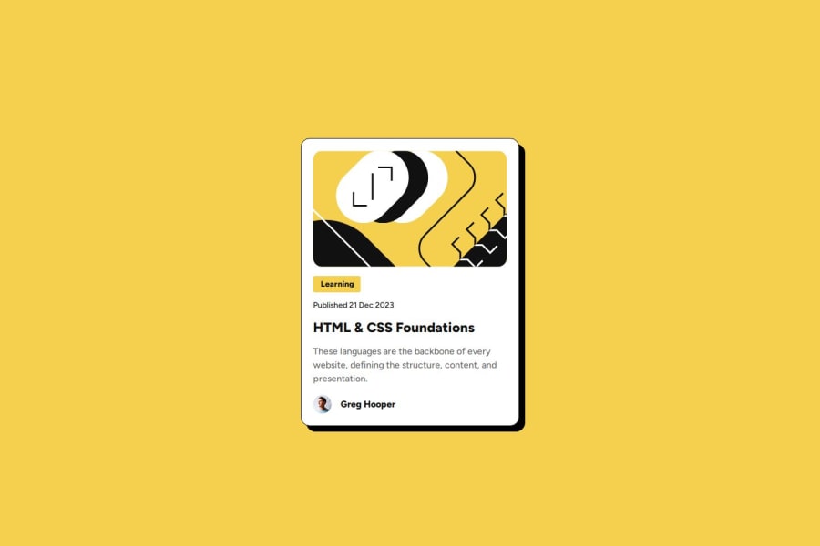
Design comparison
SolutionDesign
Solution retrospective
What are you most proud of, and what would you do differently next time?
This one wasn't super challenging. I am just proud that I got my solution to be reasonably close to the design.
What challenges did you encounter, and how did you overcome them?The main challenge in this one was getting the font sizes to be responsive without media queries. I ended up using the clamp() function to achieve responsive typography and card sizing.
- While clamp() seemed to work well in this case for implementing responsive typography and layout, I would like to explore additional techniques for handling responsiveness. I would appreciate feedback on how to better handle extreme screen sizes (both small and large) and ensure that the design remains visually appealing across all devices.
- While I tried my best to ensure the project was semantically structured and included basic accessibility features (like alt attributes), there’s always room for improvement. I’d like feedback on how to improve the accessibility of my card component, particularly for users who rely on screen readers or keyboard navigation.
- Although the typography is responsive, fine-tuning font sizes, line heights, and spacing for optimal readability can be tricky. I’m seeking feedback on how to fine-tune typography and spacing for better readability and visual hierarchy across different devices.
- I'd like feedback on my uses of grid on the blog preview card itself to control the layout of its child elements.
- I'd like feedback on my use of flexbox for the author element.
Community feedback
Please log in to post a comment
Log in with GitHubJoin our Discord community
Join thousands of Frontend Mentor community members taking the challenges, sharing resources, helping each other, and chatting about all things front-end!
Join our Discord
