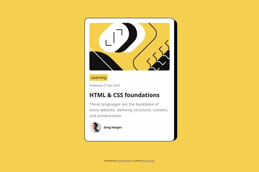


Design comparison
SolutionDesign

Community feedback
- @StroudyPosted 2 months ago
Hey, Great job with this solution you should be proud, A few things I noticed,
- At 360px your box shadow breaks, you can avoid this by not using
position: absolute;instead you could use thisbox-shadow: 0.563rem 0.5rem black;, - Missing a
<meta>description tag for SEO purposes, - Setting a height and width attribute to your
<img>will increase performance to reduce layout shifts and improve CLS, It reserves the space on the page for the image, - It is best practice to have a
<main>tag inside your body highlighting the main section. - Using
max-width: 100%ormin-width: 100%is way more responsive then justwidth:100%, check out this article also from the same Frontend mentor dev responsive-meaning, she goes into more detail. - You should avoid using
pxas it is an absolute unit and not a responsive unit likeremorem, You should look at this article from a Frontend mentor dev, Why font-size must NEVER be in pixels. - Another great resource for px to rem converter.
- Line height is usually unitless instead of
line-height: 150%;should useline-height: 1.5;this means it is 1.5 x the font-size, unitless value ensures that the line height will scale proportionately. - Having better
alt=""descriptions for accessibility is a must check this out Write helpful Alt Text to describe images, - You should apply a full modern reset to make things easier as you build, check out this site for a Full modern reset
- Using a naming convention like BEM, Using proper naming will prepare you for the changes in design of the website.
- It is best practice to use
margin-inline: auto;to center left and right then than justmargin: auto;, You can center the height by using this code snippet
  min-height: 100svh;
  display: flex;
  justify-content: center;
  flex-direction: column;
I hope you found some of this information helpful, You should give the articles a good read and I look forward to seeing some more from you, Happy coding! 💻
0 - At 360px your box shadow breaks, you can avoid this by not using

Please log in to post a comment
Log in with GitHub
Join our Discord community
Join thousands of Frontend Mentor community members taking the challenges, sharing resources, helping each other, and chatting about all things front-end!
Join our Discord