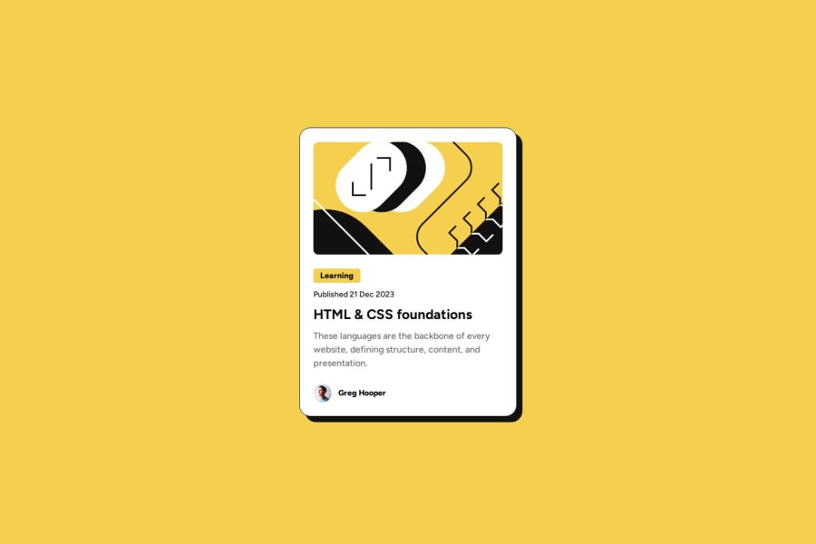
You need to pick up some important learnings from this. Make sure you refactor before moving on to anything else.
- it's better for performance to link fonts in the html head instead of css imports.
- move your css to its own file and link in the head of the html.
- wrap this component in a
main
landmark. It's not strictly necessary in a component demo page like this but a good habit to get into now so you don't forget later. Every page needs one main landmark element. - if adding the main image as an inline svg instead of img element I assume you consider it to be a decorative image (not communicating anything). If so this definitely needs
aria-hidden="true" focusable="false"
. If you think it's important content reference it in an img tag instead and give it a meaningful alt description. - text should never be in divs or spans alone really. Use a meaningful element (even paragraph).
- there is one crucially important element missing from this. This component is meant to have a function (purpose). It's meant to signpost users to a blog article. Did you also notice the hover style in the design? These things tell you there must be an interactive element in the component! The heading must have a link inside it wrapping the text of the blog title.
- to make the whole card clickable you can then add a pseudo element to the link, make the card position relative and make the pseudo position absolute and sized to cover the card. Now the link will cover the whole thing making it all clickable.
- is "avatar" a meaningful description of that image? I suggest you read the posts in discord resources channel about how and when to write good alt text.
- get into the habit of including a full modern css reset at the start of the styles in every project. Andy Bell or Josh Comeau both have good ones you can look up and use.
- don't limit the height of elements that contain text, including the body. Remove the height 100vh and use min-height 100svh instead. That allows the body to extend beyond the height of the screen when necessary (e.g. On mobile landscape).
- the card must not have a width. Set a max width in rem instead. This allows the card to shrink narrower when necessary. (E.g. On small phones)
- you rally must not nest css selectors as you are doing currently. It's increasing css specificity and will lead to horrible impossible to manage css once you reach larger projects. Stick to single class selectors as much as possible.
- font size shouldn't ever be in px. Use rem so that user text size settings are honoured.
- there is no need for a media query in this. Once you make the changes above you'll be able to remove it. But for future reference, style mobile first and use min-width media queries defined in rem or em not px. This will make layouts more robust and adapt correctly even when users have different text size settings.
- make sure you check your solution on smaller screens (eg 320px x 256px) and test with a keyboard. These will help you be more sure solutions are likely to be accessible. This currently hits my screen on the sides so make sure there is always some space there like shown in the design.
Marked as helpful