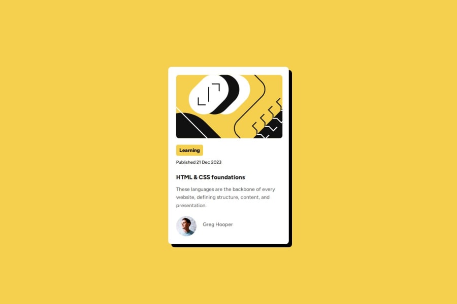
Design comparison
Solution retrospective
I am most proud of not giving up on making it better when it was at 90%.
What challenges did you encounter, and how did you overcome them?I had to relearn a lot from the previous challenge, not much was left in my head, but I guess that's practice for you.
What specific areas of your project would you like help with?I couldn't get the active state of the text to work on github even though it works ok on local.
Community feedback
- @codi-AndrePosted about 1 month ago
Good work! You are very close to the design, add a border to the card, the mobile screen is not ok on firefox
Open firefox browser type 'ctrl + shift + m' and select a smaller screen, you will see that the styles you added are crushing the page, take a look at modern-normalize github repository, browsers have different styles, this will help set them equal.
Some of your css comments are redundant or unnecessary, look at modern-normalize css comments you will see what i mean.
You are styling some tags you do not use, there is a lot of challenges, take easy.
Careful when using relative units like vh, vw, % and similar, when setting padding and margin prefer using px unit, if you need different values, use calc(), clamp(), media queries and similar.
Search for prettier plugin, it will format your code for you.
Marked as helpful0 - @CarlitaaltPosted about 1 month ago
Ta solution est top, la ressemblance y est, peut être une légère différence au niveau de la width mais c'est du super travail bravo
0
Please log in to post a comment
Log in with GitHubJoin our Discord community
Join thousands of Frontend Mentor community members taking the challenges, sharing resources, helping each other, and chatting about all things front-end!
Join our Discord
