Not Found
Not Found
Not Found
Not Found
Not Found
Not Found
Not Found
Not Found
Not Found
Not Found
Not Found
Not Found
Not Found
Not Found
Not Found
Not Found
Not Found
Not Found
Not Found
Not Found

Submitted

Blog Preview Card

@NkululekoCyrilCele

Desktop design screenshot for the Blog preview card coding challenge

This is a solution for...

  • HTML
  • CSS
1newbie
View challenge

Design comparison


SolutionDesign

Solution retrospective


What are you most proud of, and what would you do differently next time?

I’m most proud of how well the blog preview card looks across different screen sizes. Achieving a responsive design without relying heavily on media queries was a key success, especially when adjusting font sizes for mobile view. The hover and focus states also came out quite polished, enhancing the overall user experience.

What I would do differently next time is to experiment more with using CSS Grid instead of Flexbox. While Flexbox worked well for this project, I think CSS Grid could allow for more creative layout possibilities in future challenges. I’d also spend more time fine-tuning the accessibility features, particularly with screen readers.

What challenges did you encounter, and how did you overcome them?

One challenge I encountered was making sure that the typography scaled properly on smaller screens without using media queries. Since the font sizes in this design were slightly smaller on mobile, I relied on relative units (rem) to adjust font sizes based on the container. This took some tweaking, but I eventually got the desired outcome through careful testing.

Another challenge was ensuring that all interactive elements had clear and accessible focus states. Initially, the focus states were inconsistent across browsers, so I standardized them using custom :focus-visible styles and ARIA attributes.

What specific areas of your project would you like help with?

I’d appreciate feedback on the accessibility of the card, particularly when using screen readers. While I’ve used ARIA roles and attributes, I want to ensure I’m following best practices.

I’d also like input on how to further minimize the use of media queries for responsive design. Are there any other techniques I could explore that might offer more flexibility?

Lastly, I’m looking for tips on improving the visual hierarchy, particularly when it comes to managing different font weights and sizes without making the text too visually overwhelming. Any insights on balancing typography in this context would be helpful!

Community feedback

P
Steven Stroud 11,810

@Stroudy

Posted

Exceptional work! You’re showing great skill here. I’ve got a couple of minor suggestions that could make this stand out even more…

  • These <span> should really have semantic tags like headings (<h1> to <h6>) and paragraphs (<p>) convey structure and meaning to content, improving accessibility, SEO, and readability by helping search engines and screen readers interpret the content.
<span class="tag">Learning</span>
  • Avoid using id selectors for styling in CSS because they are too specific and hard to override, making your styles less flexible and maintainable. Instead, use class selectors (.), which are reusable and more manageable, allowing for better control over your styles and easier updates.
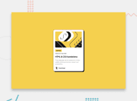
<h1 id="card-title" class="card-title">HTML & CSS foundations</h1>
  • Using a full modern CSS reset is beneficial because it removes default browser styling, creating a consistent starting point for your design across all browsers. It helps avoid unexpected layout issues and makes your styles more predictable, ensuring a uniform appearance on different devices and platforms, check out this site for a Full modern reset

  • While px is useful for precise, fixed sizing, such as border-width, border-radius, inline-padding, and <img> sizes, it has limitations. Pixels don't scale well with user settings or adapt to different devices, which can negatively impact accessibility and responsiveness. For example, using px for font sizes can make text harder to read on some screens, Check this article why font-size must NEVER be in pixels. In contrast, relative units like rem and adjust based on the user’s preferences and device settings, making your design more flexible and accessible. Use px where exact sizing is needed, but prefer relative units for scalable layouts. If you want a deeper explanation watch this video by Kevin Powell CSS em and rem explained. Another great resource I found useful is this px to rem converter based on the default font-size of 16 pixel.

  • I think you can benefit from using a naming convention like BEM (Block, Element, Modifier) is beneficial because it makes your CSS more organized, readable, and easier to maintain. BEM helps you clearly understand the purpose of each class, avoid naming conflicts, and create reusable components, leading to a more scalable codebase. For more details BEM,

I hope you’re finding this guidance useful! Keep refining your skills and tackling new challenges with confidence. You’re making great progress—stay motivated and keep coding with enthusiasm! 💻

Marked as helpful

0

@NkululekoCyrilCele

Posted

@Stroudy Thank you tons! This is very helpful and detailed.

1
P
Steven Stroud 11,810

@Stroudy

Posted

Hey @NkululekoCyrilCele, No problem, You got this! 💪

1

Please log in to post a comment

Log in with GitHub
Discord logo

Join our Discord community

Join thousands of Frontend Mentor community members taking the challenges, sharing resources, helping each other, and chatting about all things front-end!

Join our Discord