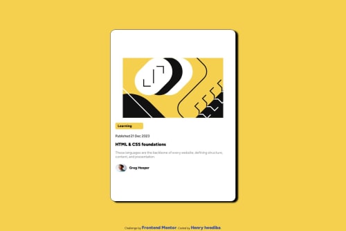
Design comparison
Solution retrospective
I am most proud of the fact that i could attempt this challenge
What challenges did you encounter, and how did you overcome them?Media query
What specific areas of your project would you like help with?media query and proper arrangements of codes
Community feedback
- @joaomoritaPosted 6 months ago
Hey! Great work there! You could use more semantics HTML. You didn't need a container div if you already have a main, you could put the main css at the body tag, and the container css at the main tag. You can use more responsive units to your image and paragraphs too. It's very helpfull look how other people did the same challenge and look for ways to improve. Check out this article about semantc elements: https://www.w3schools.com/html/html5_semantic_elements.asp
I hope I can help you in some way
1@iwedibahPosted 6 months ago@joaomorita Thank you so much for the review and your correction i will effect it in my next challenge
0 - @eugabrieldesousaPosted 6 months ago
s
1@iwedibahPosted 6 months ago@eugabrieldesousa thank you gabby tho i am trying to understand the comment
0@iwedibahPosted 6 months ago@eugabrieldesousa thank you gabby tho i am trying to understand the comment
0@eugabrieldesousaPosted 6 months ago@iwedibah oh sorry man, its a wrong comment for my part, now, your code is good, maybe your padding is more than necessary
0
Please log in to post a comment
Log in with GitHubJoin our Discord community
Join thousands of Frontend Mentor community members taking the challenges, sharing resources, helping each other, and chatting about all things front-end!
Join our Discord