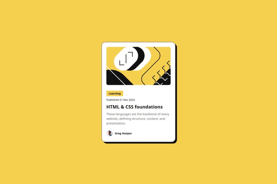
Design comparison
Solution retrospective
I'm most proud of using what I learned from the last project (namely rems, semantic markup) in this one, as well as finishing another project in general! :D
What challenges did you encounter, and how did you overcome them?I mainly struggled with organizing all the things I needed to do so I broke it down step-by-step into small problems.
What specific areas of your project would you like help with?Any feedback is welcome! I'd like to know if there are things I can do better such as if the way I'm styling with css is too strict and won't allow for scaling, or if the way I'm styling the HTML is too verbose.
Please log in to post a comment
Log in with GitHubCommunity feedback
- @dar-ju
Hi AmyH-goose!
I noticed that you are not new in HTML and CSS. Great job!
Just a little bit that can be fixed:
- look at the images used in this card. For example, the avatar, it is not abstract, but of a specific person, which means that semantically it is an important image and it is connected correctly - via the <img> tag. But the image of the card itself does not carry any meaning except decoration, which means it can be connected via the CSS background-image. The way you have done it is not a error, but as a background - it will be better. There are no other background images in this project, but they include icons, badges and other decor.
- also semantically, for any dates and times you need to use the <time> tag. In this case, you need to use the following line:
<time class="publish-date figtree-med" datetime="2023-12-21">Published 21 Dec 2023</time>. This will help search engines and readers to interpret dates correctly. You can read about time tag here.
Everything else is great, hope I was useful. Good luck with your developments!
Marked as helpful - @Jair117
I liked it
Join our Discord community
Join thousands of Frontend Mentor community members taking the challenges, sharing resources, helping each other, and chatting about all things front-end!
Join our Discord
