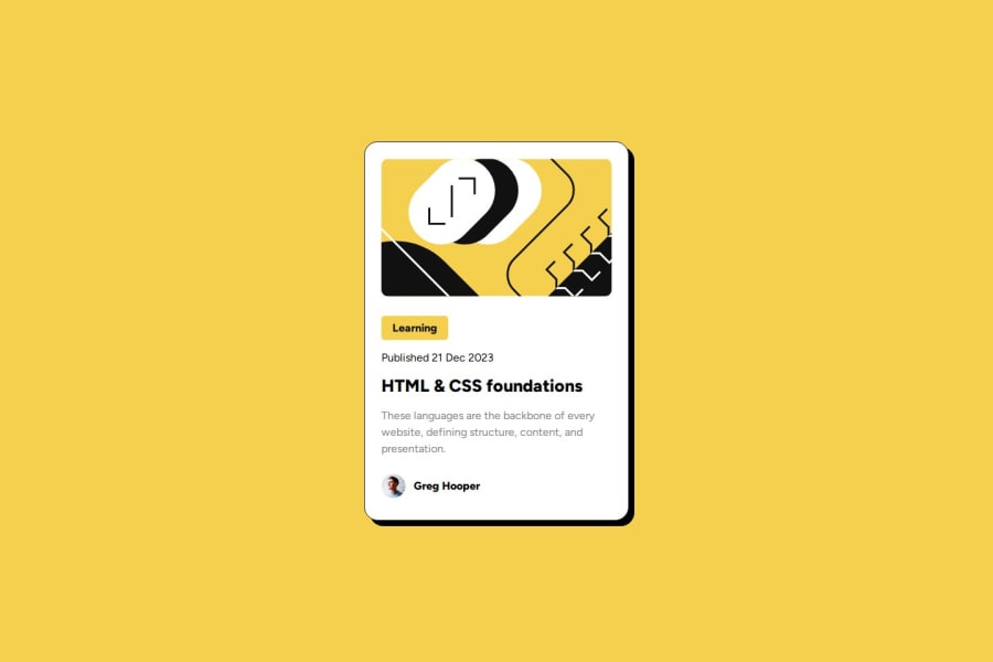
Design comparison
SolutionDesign
Solution retrospective
What challenges did you encounter, and how did you overcome them?
I was facing issues in getting the Figma designs and the padding and other property values are not being shown and I checked few resources and I was able to catch up with it.
What specific areas of your project would you like help with?In the mobile screen I have used the small screen media query at 767px is this okay?
Please log in to post a comment
Log in with GitHubCommunity feedback
No feedback yet. Be the first to give feedback on Vishal Pawar's solution.
Join our Discord community
Join thousands of Frontend Mentor community members taking the challenges, sharing resources, helping each other, and chatting about all things front-end!
Join our Discord
