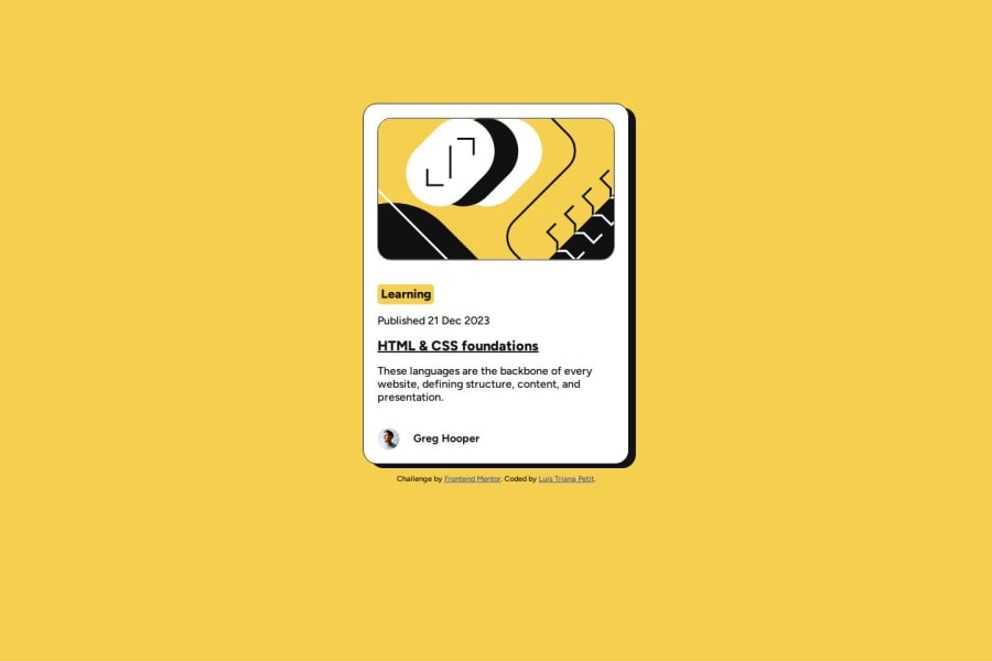
Design comparison
SolutionDesign
Solution retrospective
What are you most proud of, and what would you do differently next time?
Un muy buen reto, para iniciar
What challenges did you encounter, and how did you overcome them?Los desafios comprender el modelo de caja, display: block, display: flex.
Community feedback
- @AdrianoEscarabotePosted about 1 month ago
Hello Luis Triana P, how are you? I was really pleased with your project, but I’d like to offer some advice that might help:
I noticed that your card is not centered, to solve this problem we can do this:
.container {
    /* margin-top: 150px; */
    display: flex;
    flex-direction: column;
    align-items: center;
    justify-content: center;
    min-height: 100vh;
}
The rest is spot on.
Hope it’s helpful to you. 👍
0 - @yiorgosbagakisPosted about 1 month ago
This is a very good and accurate solution. Maybe some semantic HTML would improve it, because there are a lot of 'div' elements at the moment.
0
Please log in to post a comment
Log in with GitHubJoin our Discord community
Join thousands of Frontend Mentor community members taking the challenges, sharing resources, helping each other, and chatting about all things front-end!
Join our Discord
