Solution retrospective
What are you most proud of, and what would you do differently next time?
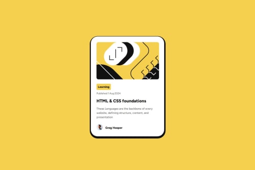
I keep pushing and putting into practice my CSS to finally be able to build things I'm proud of.
What challenges did you encounter, and how did you overcome them?I think images are still something I need to work more with because they then to behave a little different from what I expect, I solve my issue with percentages
What specific areas of your project would you like help with?I would like to know why when trying to center the username with their image the text does not align vertically, I ended up using margin bottom to center the name to the middle of the image, I'm pretty sure there's a better solution to that
Code
Loading...
Please log in to post a comment
Log in with GitHubCommunity feedback
No feedback yet. Be the first to give feedback on Carmen's solution.
Join our Discord community
Join thousands of Frontend Mentor community members taking the challenges, sharing resources, helping each other, and chatting about all things front-end!
Join our Discord