Design comparison
Solution retrospective
I've learned using more information about sizes and spaces from figma file. I used it and planned my code better - for example using flexbox with gaps for spacing elements.
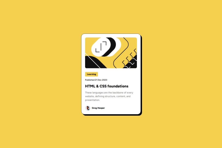
What challenges did you encounter, and how did you overcome them?The most challenging thing was making perfect yellow label "Learning", because when I used flexbox it's turned into block element even when I changed display property do "inline-block". Propably display wasn't problematic but default flexbox behavior which makes all content take all free space like block elements do. I just put that label word into span and it works fine.
What specific areas of your project would you like help with?I don't know if it was necessary to use "span" for a label element. Maybe there is another way to make horizontal padding works while being flexbox item.
Community feedback
Please log in to post a comment
Log in with GitHubJoin our Discord community
Join thousands of Frontend Mentor community members taking the challenges, sharing resources, helping each other, and chatting about all things front-end!
Join our Discord
