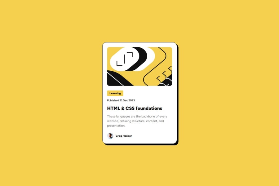
Design comparison
SolutionDesign
Solution retrospective
What are you most proud of, and what would you do differently next time?
Got better at dividing the markup into semantic tags. The design is nearly pixel perfect.
What challenges did you encounter, and how did you overcome them?The .tag element had some issues regarding its width, so I found out that there is a width: min-content; property in a Youtube video. Also, at first glance I did not realise that the sizes change when the content is displayed on a big screen. (Firefox is weird when it comes to things like border or shadow, but whatever)
What specific areas of your project would you like help with?I would like to get better at writing CSS faster. Any tricks would be appreciated
Community feedback
Please log in to post a comment
Log in with GitHubJoin our Discord community
Join thousands of Frontend Mentor community members taking the challenges, sharing resources, helping each other, and chatting about all things front-end!
Join our Discord
