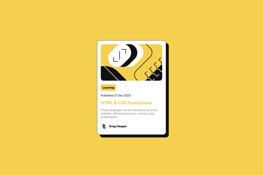
Design comparison
SolutionDesign
Solution retrospective
What are you most proud of, and what would you do differently next time?
.
What challenges did you encounter, and how did you overcome them?.
What specific areas of your project would you like help with?.
Please log in to post a comment
Log in with GitHubCommunity feedback
- @DanCodeCraft
Image-wise:
- The hovering effect is missing
- When reducing the image to 375px, the sizing is out of proportion and overruns the screen
- You have a good eye for spacing and letter sizing
Code-wise:
- avoid using IDs. Rather, have classes instead. IDs are for unique elements, and for longer projects you would certainly run into a ton of issues
- never use font size in pixels. I just learned about it and the reasons are many. I was recommended this link (https://fedmentor.dev/posts/font-size-px/) and I'm recommending it back to you
- instead of using the percentage for width, use padding. I made the same mistake at first and got corrected.
All the best!
Marked as helpful
Join our Discord community
Join thousands of Frontend Mentor community members taking the challenges, sharing resources, helping each other, and chatting about all things front-end!
Join our Discord
