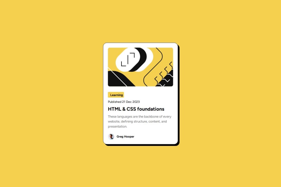


Design comparison
SolutionDesign

Solution retrospective
What are you most proud of, and what would you do differently next time?
Being able to use flexbox and clamp function
What challenges did you encounter, and how did you overcome them?Using focus and hover states on css
What specific areas of your project would you like help with?To be able to make it more responsive
Community feedback
- @BlackpachamamePosted 24 days ago
Hey your solution is amazing! 🤩
📌 Some suggestions
- For your
<div>Published 21 Dec 2023</div>you can use thetimetag:<p>Published <time datetime="2023-12-21">21 Dec 2023</time></p>. More info - You can apply
display: blockto the image to remove the white space generated underneath. Although visually in this case it is irrelevant, it helps you better calculate the space with other elements - Apply
flex-shrink: 0to your image, why? - A good tip for naming CSS classes is to use the BEM methodology
- To make it look better on mobile screens, you can add a
margin: 10pxto yourbodyand remove it for larger screens. And in yourcontaineryou can changewidth: 384pxtomax-width: 384px. This will prevent your content from being cut off if the screen has a width smaller than 384px. - I don't see much use in using
flex-flowhere
Marked as helpful1 - For your
- P@codejerooPosted 24 days ago
Hi, thank you for the feedback! I used flex-shrink = 0 so that the image won't resize lower than its original size but yes, you're correct it was unnecessary. I used flex flow instead of flex-direction to set it up to column but looks like it was unnesscary too. I will try to implement what you've said. Thank you for the suggestions! Especially about the BEM naming convention and the time tag!
0

Please log in to post a comment
Log in with GitHub
Join our Discord community
Join thousands of Frontend Mentor community members taking the challenges, sharing resources, helping each other, and chatting about all things front-end!
Join our Discord