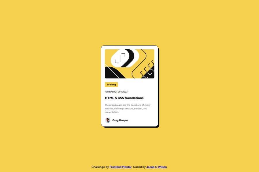
Design comparison
Solution retrospective
What did you find difficult while building the project?
This challenge provided a means to build my understanding of box shadows. I didn't much of a problem with anything else.
Which areas of your code are you unsure of?
I wanted to be sure that the code was organized and the styling names made as much sense as I could make of it.
Do you have any questions about best practices?
Was the use of the spans appropriate in the ways that I had used them? Or should I have used a different block element?
Community feedback
- @Abed001Posted 10 months ago
hi @legaldrummer try this for your card hover .cardshadow{ box-shadow: 10px 10px rgba(0,0,0);
} .cardshadow:hover { box-shadow: 15px 15px rgba(0, 0, 0); /* Increase shadow size and opacity on hover */ } in your css for the active state hope I helped.
0
Please log in to post a comment
Log in with GitHubJoin our Discord community
Join thousands of Frontend Mentor community members taking the challenges, sharing resources, helping each other, and chatting about all things front-end!
Join our Discord
