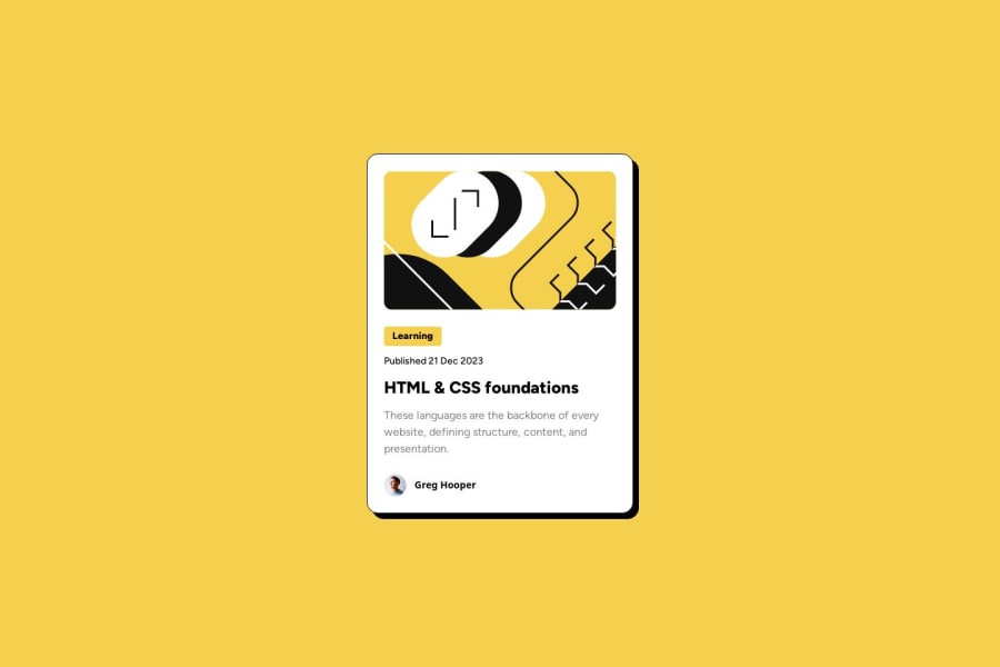
Design comparison
SolutionDesign
Solution retrospective
What are you most proud of, and what would you do differently next time?
I am proud that I managed to quickly figure how to convert figma "hug" with flexbox. Maybe, not optimal but it works
What challenges did you encounter, and how did you overcome them?Never used drop shadow. so i had to figure out how it works
What specific areas of your project would you like help with?I still need a way to compare my solution to the screenshots. is there a tool like on frontend mentor? need fo find out or maybe make my own
Please log in to post a comment
Log in with GitHubCommunity feedback
- @lacosta
Great job! I find it very interesting that you're building a "monorepo" with all the FrontendMentor challenges. Keep rocking it!
Join our Discord community
Join thousands of Frontend Mentor community members taking the challenges, sharing resources, helping each other, and chatting about all things front-end!
Join our Discord
