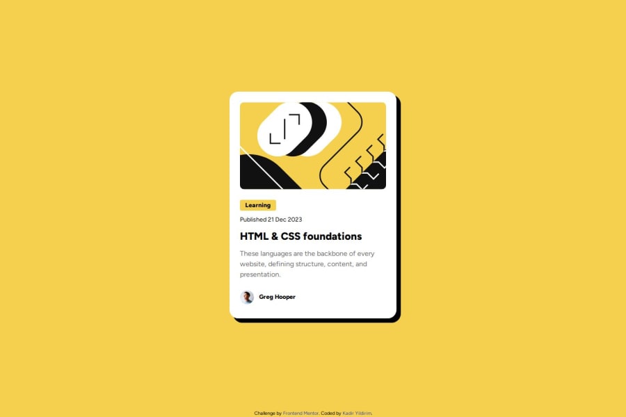


Design comparison

Solution retrospective
I had a problem when centering 2 divs. I couldn't put the first div in the center, the 1st div was at the beginning and the 2nd div was at the end. By adding the 3rd div I was able to solve the problem.
What specific areas of your project would you like help with?Is my use of Flexbox correct? What can I do for better placement?
Community feedback
- @SheGeeksPosted 3 months ago
You definitely used flexbox correctly to center the card and structure the card contents.
I noticed you're using an absolute value (
px) to set the width of the card. When you need an element to be adaptable, like the width of this card, it's best to avoid giving it an absolute value.For a better approach set the card width to 100% (
width: 100%) to always take up the available space in width and give it a max-width of your absolute value (max-width: 384px) to limit how big it can grow.With these changes, your card will always take up the maximum amount of available width space no matter what screen size, but never more than 384px. In my solution I think I also set a
min-widthto prevent it from going below a certain size. That's optional though.Marked as helpful0@kadiryildiriPosted 3 months ago@SheGeeks Thank you for your advice. I will use your suggestion in my next coding
0 - @Mina546845414h55gPosted 3 months ago
In the first congratulation! your coding is really great but you want to decrease the size of container and good luck
1


Please log in to post a comment
Log in with GitHub
Join our Discord community
Join thousands of Frontend Mentor community members taking the challenges, sharing resources, helping each other, and chatting about all things front-end!
Join our Discord