Design comparison
SolutionDesign
Community feedback
- @suresh298877Posted about 1 year ago
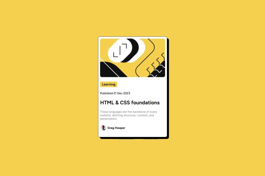
just try to deacrease the heights of the card. It will look great.
Marked as helpful1@thomasshelbyyyPosted about 1 year ago@suresh298877 Thanks, i don't use the figma file actually, so i don't know all the specifications (the width, height, etc), i just tried to make it look as similar as i can
0
Please log in to post a comment
Log in with GitHubJoin our Discord community
Join thousands of Frontend Mentor community members taking the challenges, sharing resources, helping each other, and chatting about all things front-end!
Join our Discord
