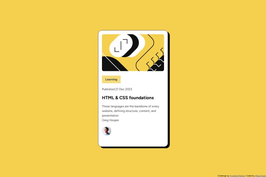
Design comparison
Community feedback
- @Tanya-abiPosted 4 months ago
Well done, you completed your activity.
Try your best to follow the specifications set in the figma file. For accessibility and readability purposes, remember to use semantics in your code.
When it comes to the Author section, try to use display:flex method to align the items.
Your site is not responsive, you should use @media queries to help you with that. Always remember to design for the phone sizes first.
Marked as helpful0 - @Edifierx8Posted 4 months ago
Thanks for your feedback.I will add @media queries and display: flex; to it and if there anythink left tell me. Kind regards Ahsan Raza.
0
Please log in to post a comment
Log in with GitHubJoin our Discord community
Join thousands of Frontend Mentor community members taking the challenges, sharing resources, helping each other, and chatting about all things front-end!
Join our Discord
