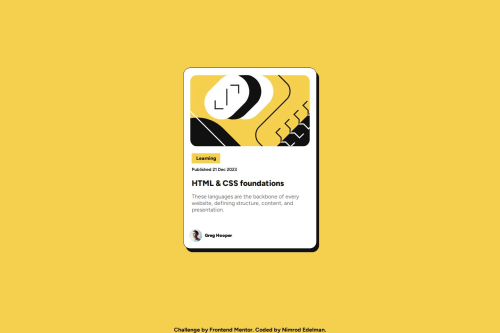
Not Found
Not Found
Not Found
Not Found
Not Found
Not Found
Not Found
Not Found
Not Found
Not Found
Not Found
Not Found
Not Found
Not Found
Not Found
Not Found
Not Found
Request path contains unescaped characters

Submitted

Blog preview card - responsive

P
nimrodEDE 140

@nimrodEDE

Desktop design screenshot for the Blog preview card coding challenge

This is a solution for...

  • HTML
  • CSS
1newbie
View challenge

Design comparison


SolutionDesign

Solution retrospective


What are you most proud of, and what would you do differently next time?

I tried to use better units , focusing on rem units and percentages.

i am proud of the fact that centering a div isn't such an issue anymore :).

What challenges did you encounter, and how did you overcome them?

Im still trying to figure out the best way to create a responsive design and to build code that is easy to maintain.

Community feedback

P
Steven Stroud 9,760

@Stroudy

Posted

Awesome job tackling this challenge! You’re doing amazing, and I wanted to share a couple of suggestions that might help refine your approach…

  • Avoid using id selectors for styling in CSS because they are too specific and hard to override, making your styles less flexible and maintainable. Instead, use class selectors (.), which are reusable and more manageable, allowing for better control over your styles and easier updates.

  • Using rem or em units in @media queries is better than px because they are relative units that adapt to user settings, like their preferred font size. This makes your design more responsive and accessible, ensuring it looks good on different devices and respects user preferences.

  • For future project, You could downloading and host your own fonts using @font-face improves website performance by reducing external requests, provides more control over font usage, ensures consistency across browsers, enhances offline availability, and avoids potential issues if third-party font services become unavailable. Place to get .woff2 fonts

You’re doing fantastic! I hope these tips help you as you continue your coding journey. Stay curious and keep experimenting—every challenge is an opportunity to learn. Have fun, and keep coding with confidence! 🌟

Marked as helpful

0
MikDra1 6,680

@MikDra1

Posted

Well done, here are some things to review 😊:

  • REM for Units: It's best to use rem for all units instead of px, as this ensures scalability and consistency in spacing and font sizes based on the user's root font size. It helps improve accessibility.

  • Semantic HTML: Consider ensuring all elements are wrapped in semantic HTML tags like <main>, <section>, and <article> to enhance the structure and SEO-friendliness of the page.

  • CSS Variables: Implement CSS variables (--primary-color, --font-size, etc.) for consistent values across the stylesheet. This will allow for easier theme management and tweaking.

  • BEM/Convention for Class Naming: Apply a class naming convention like BEM (Block Element Modifier) to make the styles modular and more maintainable. For example, use .card__title or .card--highlighted.

  • CSS Reset: Consider adding a full modern CSS reset (like normalize.css or custom resets at the beginning of the stylesheet) to ensure consistent styling across different browsers. Here is a link to one I really like.

  • Clamp() for Responsiveness: Use the clamp() function for fluid typography and spacing, allowing elements to resize smoothly between a minimum and maximum value based on the viewport size (e.g., font-size: clamp(1rem, 2vw, 1.5rem)).

  • Responsive Card: To make the card responsive, ensure the layout uses flex or grid combined with max-width instead of fixed width values. This will make the design more flexible and adapt better to different screen sizes.

  • Use max-width/min-width and max-height/min-height: Instead of using fixed width and height, opt for max-width or min-width to allow the elements to resize smoothly on different screen sizes, improving overall responsiveness.

Hope you found this comment helpful 💗💗💗

Good job and keep going 😁😊😉

Marked as helpful

0

Please log in to post a comment

Log in with GitHub
Discord logo

Join our Discord community

Join thousands of Frontend Mentor community members taking the challenges, sharing resources, helping each other, and chatting about all things front-end!

Join our Discord