Not Found
Not Found
Not Found
Not Found
Not Found
Not Found
Not Found
Not Found
Not Found
Not Found
Not Found
Not Found
Not Found
Not Found
Not Found
Not Found
Not Found
Not Found
Not Found
Not Found

Submitted

Blog preview card - HTML CSS

kubabebe 20

@kubabebe

Desktop design screenshot for the Blog preview card coding challenge

This is a solution for...

  • HTML
  • CSS
1newbie
View challenge

Design comparison


SolutionDesign

Solution retrospective


What are you most proud of, and what would you do differently next time?

Thanks to the experience from the previous challenge, doing this was much easier.

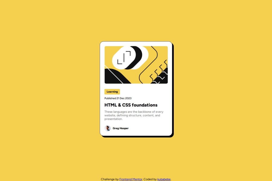
What challenges did you encounter, and how did you overcome them?

Fit image from normal view into 'smaller device' view.

img {
      width: 279px;
      height: 200px;
      object-fit: cover;
      border-radius: 10px;
    }

What specific areas of your project would you like help with?

Code review.

Community feedback

P
Koda👹 3,810

@kodan96

Posted

hi there! 👋

you shouldn't apply width and height directly to your elements, their child elements should determine these dimensions. If you really want to determine their width use max-width along with the width property using relative units.

You should avoid hard-coded values (pixels) most of the time. When you use these values you give up responsiveness(or you make it harder for yourself at least)..

Typically you will increase the font-size property with @media queries. If you have hard-coded values all over your CSS, you need to modify every element's font-size . On the other hand, if you use rem -s all you need to do is changing the font-size in your CSS :root selector and all your elements will have a new size based on that value.

I usually use em for padding and margin for text-based elements, since their margin usually based on their font-size , and again, when you change the font-size in :root these values will scale up as well without you touching them, making your job easier and your page maintainable..

Hope this was helpful 🙏

Good luck and happy coding! 💪

Marked as helpful

1

kubabebe 20

@kubabebe

Posted

@kodan96

Thank you for your comprehensive answer. I will try to do the challenge again, following your advice.

Best Regards :)

1

@francisco320

Posted

to answer your second question what i do is

**<div class "img-container"> <img>

</div> them on css i made this .img-container{ width:320px } and to img img{ width:100%; height:auto; } **
1

Please log in to post a comment

Log in with GitHub
Discord logo

Join our Discord community

Join thousands of Frontend Mentor community members taking the challenges, sharing resources, helping each other, and chatting about all things front-end!

Join our Discord