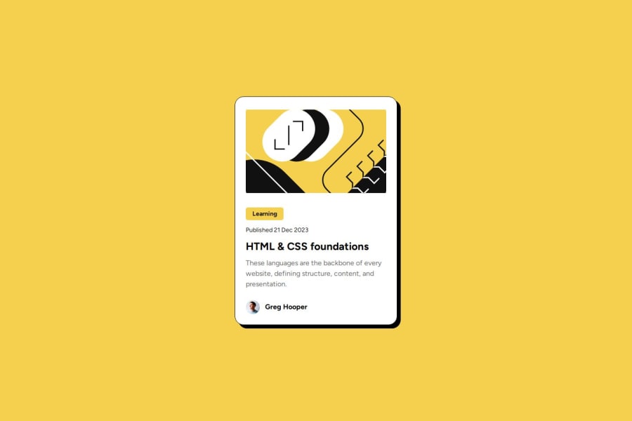
Design comparison
Solution retrospective
I improved my use of flexbox for responsive design and feel more confident creating layouts faster. I'm also improving at using working from the Figma design files and trying to get the final design as close to the brief as possible.
Next time I would try to get the design 100% the same as the figma file, and also use semantic HTML for completely.
What challenges did you encounter, and how did you overcome them?I had trouble with the yellow background on the tag, and getting it's exact sizing correct, in the end I just went with adding more padding.
Join our Discord community
Join thousands of Frontend Mentor community members taking the challenges, sharing resources, helping each other, and chatting about all things front-end!
Join our Discord
