Blog Preview Card - HTML, CSS and Flexbox
Design comparison
Solution retrospective
I learned how to use css variables and how to use Figma
Community feedback
- @mudasirNadeemPosted about 2 months ago
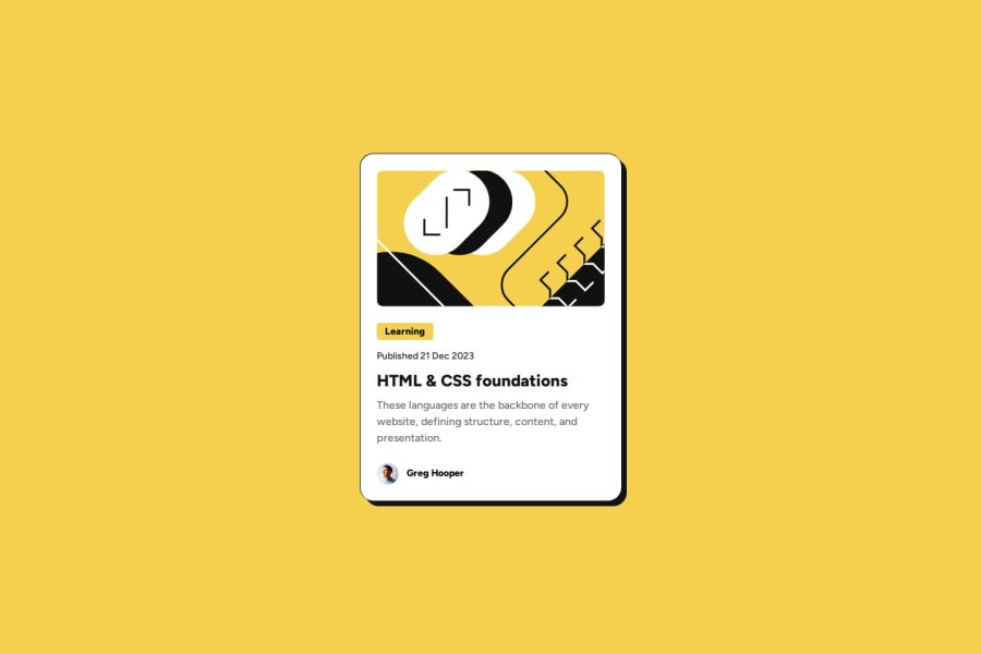
The solution demonstrates effective use of semantic HTML and is generally well-structured, but it could improve accessibility by adding alt attributes for images and using proper heading levels. While the layout looks good, consider implementing media queries for better responsiveness on smaller screens. Overall, it closely matches the design with minor adjustments needed for optimization.
Marked as helpful0 - @mudasirNadeemPosted about 2 months ago
hello Blocg page when i hover to the card the header color will chenge this is wrong so when i hover to the header to chenge color
and second learn more is button the not only text
0
Please log in to post a comment
Log in with GitHubJoin our Discord community
Join thousands of Frontend Mentor community members taking the challenges, sharing resources, helping each other, and chatting about all things front-end!
Join our Discord