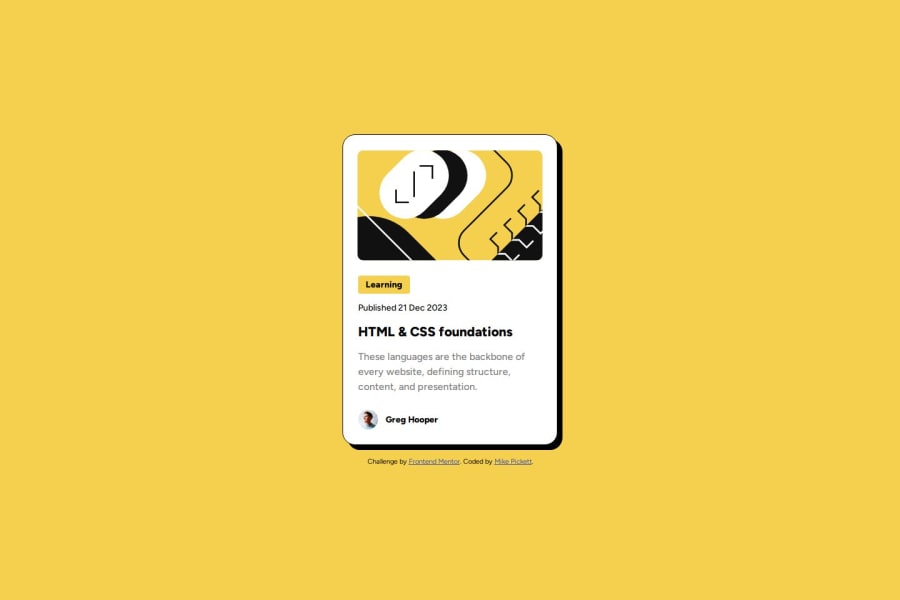
Design comparison
SolutionDesign
Solution retrospective
What are you most proud of, and what would you do differently next time?
Working mobile first on this design. The hover effects on the desktop version, remembered how to add transitions without having to look them up. Learning how to use Figma a little bit as well for finding where the code is to help when I'm stuck on a font weight or color.
What challenges did you encounter, and how did you overcome them?This challenge I was having some issues with some of the text elements, not realizing that Figma was actually giving me clues about the issue by throwing up an error to tell me the font wasn't installed, after installing the correct font everything else went together pretty easily.
Community feedback
Please log in to post a comment
Log in with GitHubJoin our Discord community
Join thousands of Frontend Mentor community members taking the challenges, sharing resources, helping each other, and chatting about all things front-end!
Join our Discord
