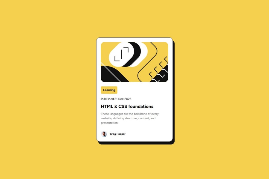
Design comparison
Community feedback
- @progValjiPosted 4 months ago
Hi James, I've taken a look at your code and it seems to me to be a good code, with semantics included and well structured. Let me tell you some points where you can improve and do so next time, the result will be amazing. Responsive font adjustment: Consider using clamp() to adapt the size of the fonts depending on the width of the screen.Accessible Hover: The h1:hover changes color to yellow, which is great, but may not be as accessible if the text is on a light background. You could include an additional effect like text-shadow or underline. I congratulate you for completing the challenge.
Marked as helpful0
Please log in to post a comment
Log in with GitHubJoin our Discord community
Join thousands of Frontend Mentor community members taking the challenges, sharing resources, helping each other, and chatting about all things front-end!
Join our Discord

