Submitted 27 days ago
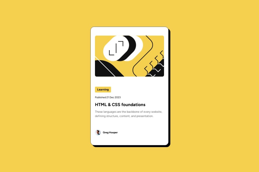
Blog Preview Card - HTML & CSS fundamentals with media queries added
@loiccape
Design comparison
SolutionDesign
Solution retrospective
What are you most proud of, and what would you do differently next time?
After reviewing some documentation, I used a mobile-first approach to minimize the need to remove CSS properties when transitioning from mobile to desktop screens.
What challenges did you encounter, and how did you overcome them?After initially developing the page starting with the desktop layout, I found myself properties from several containers for mobile screens, which didn’t feel right. It made me realize it would be better to add properties progressively rather than remove them.
Community feedback
- @LUKARS3Posted 26 days ago
Hey, there's a lot of padding-top and padding-bottom on your card component. Please reduce it
Marked as helpful0
Please log in to post a comment
Log in with GitHubJoin our Discord community
Join thousands of Frontend Mentor community members taking the challenges, sharing resources, helping each other, and chatting about all things front-end!
Join our Discord
