Solution retrospective
What are you most proud of, and what would you do differently next time?
I could reuse some code from the previous challenge, which made the process a bit faster and allowed me to focus on other aspects.
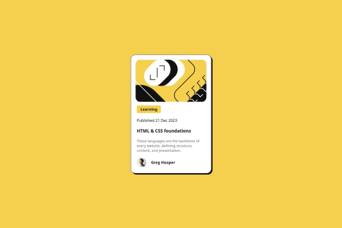
What challenges did you encounter, and how did you overcome them?Trying to get the spacing and size of the elements right, but I focused on achieving some harmony in my design instead of making an exact copy of the example.
What specific areas of your project would you like help with?I am not used to working with vibrant colors, so I would like to find a space where I can practice using this kind of color palette!
Code
Loading...
Please log in to post a comment
Log in with GitHubCommunity feedback
No feedback yet. Be the first to give feedback on hcolmenares's solution.
Join our Discord community
Join thousands of Frontend Mentor community members taking the challenges, sharing resources, helping each other, and chatting about all things front-end!
Join our Discord