

Design comparison

Solution retrospective
Orgulho de conseguir estilizar boa parte do desafio e entender os erros de alinhamento
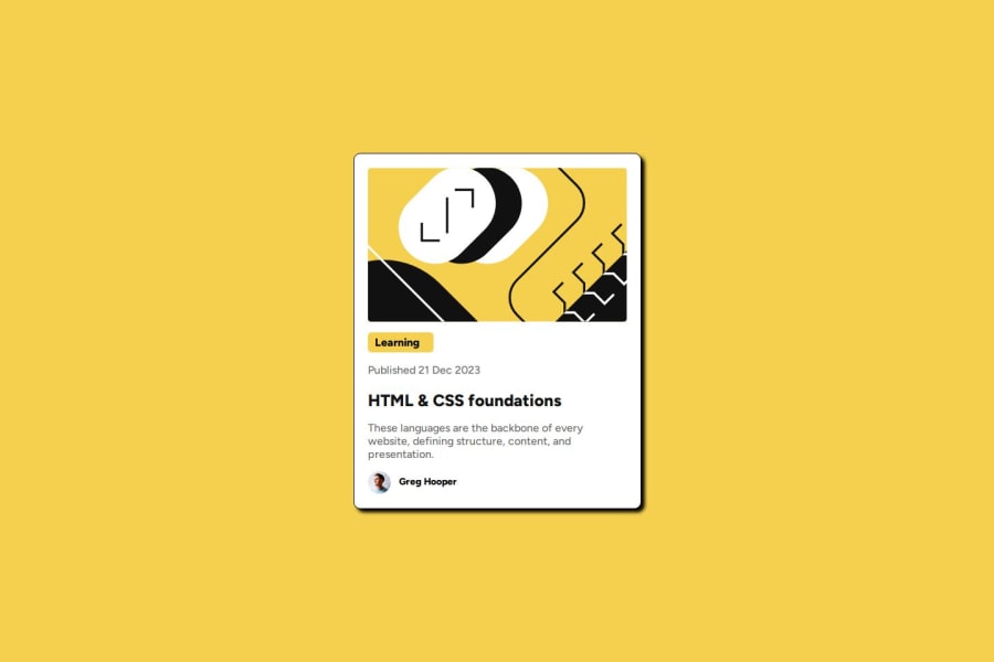
What challenges did you encounter, and how did you overcome them?Alinhar a ultima parte, o nome com a imagem do rapaz
What specific areas of your project would you like help with?Estilização
Please log in to post a comment
Log in with GitHubCommunity feedback
- P@KonradJam
Hello @Aline9402!
Try to use relative units in future projects. You can read about relative units in my post on LinkedIn Also see my LinkedIn profile for articles on HTML5 semantics.
Marked as helpful - @saimasial-bit
"Great job on the solution! The layout looks clean and responsive. However, I noticed that you haven't used semantic HTML elements like <article> and <section>. Adding them would improve accessibility and readability. Also, on smaller screens, the text alignment looks slightly off. Adjusting the padding/margins might help. Keep up the great work!"
Marked as helpful


Join our Discord community
Join thousands of Frontend Mentor community members taking the challenges, sharing resources, helping each other, and chatting about all things front-end!
Join our Discord