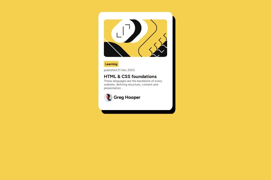
Design comparison
Solution retrospective
finishing the code under 1 hour
What challenges did you encounter, and how did you overcome them?centering the div and making it good for mobile devices, i still haven't solved them fully
What specific areas of your project would you like help with?the responsive side and centering the card vertically specifically, but any feedback will be welcomed!
Community feedback
- @ashensaviPosted 12 months ago
This is better than my one. I didn't do the mobile responsive part. This is mobile responsive also.
1 - @sivaprasath2004Posted 12 months ago
Hello, I would like to extend my congratulations on completing this challenge.
- I will see your
solution preview sitein.mainclass you will usemargin-top:3%;andtransform:translateY(4%);. If i will suggest in better way approach in your solution . -try this
body{ width: 100%; height: 100vh; display: flex; align-items: center; justify-content: center; } .main{ /* transform: translateY(4%); */ not use /* margin-bottom: 3%; */ not use /* margin-top: 3%; */ not use }0@Endy1381Posted 12 months ago@sivaprasath2004 i did not understand. what did i have to change? when i tried the code you provided me, it makes it kind of worse.
0 - I will see your
- @Litheesh-kumarPosted 12 months ago
Code looks pretty. You can improve your code by adding class names based on BEM. In the starter code you can find active-design file under asset/designs, From there you came to know what style should add to an elements when hovering or some sort of conditions.happpy coding..😊✨
0
Please log in to post a comment
Log in with GitHubJoin our Discord community
Join thousands of Frontend Mentor community members taking the challenges, sharing resources, helping each other, and chatting about all things front-end!
Join our Discord
