Design comparison
Solution retrospective
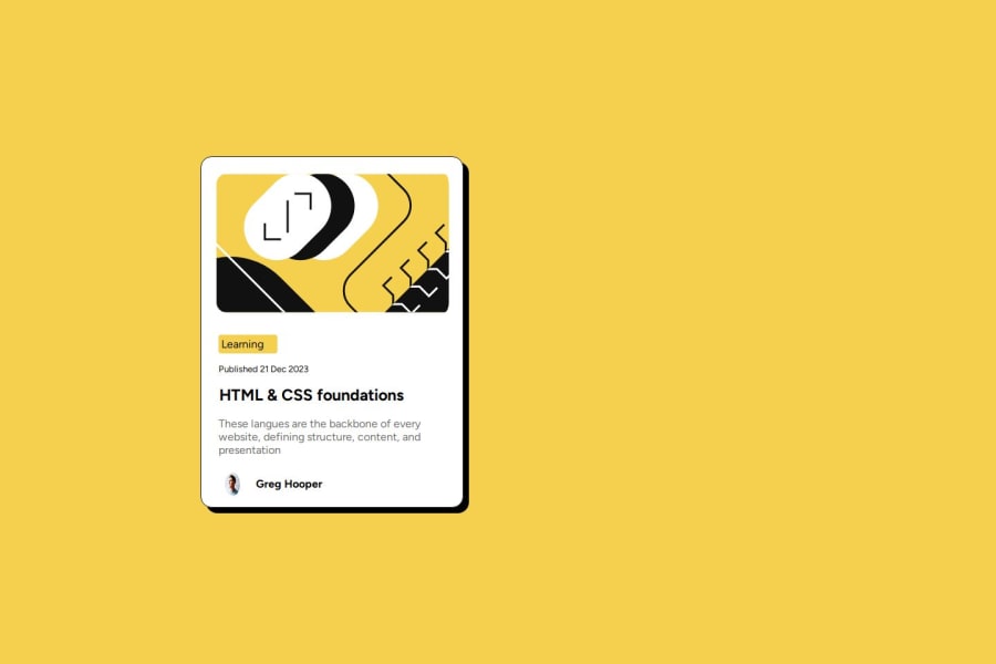
Im proud i got it to look somewhat similar, and next time i would like to have a strong understanding of flex box and grid colums and rows
What challenges did you encounter, and how did you overcome them?trying to figure out grid and rows and flex
What specific areas of your project would you like help with?learning flex grid and rows and how to keep my images center when adjusting to figure out the white border around the images.
Community feedback
- @imandreansPosted 8 months ago
There are few things that need to be considered. The size of avatar image isn't 1:1 ratio. You need to set the width and the length with the same size.
When user hovering card's title, the cursor should be pointer. The card isn't center on the screen. The 'learning' and date are differ with the original design.
To improve the design, you may take your time to do experiment and analyze the design in figma file that is available.
0
Please log in to post a comment
Log in with GitHubJoin our Discord community
Join thousands of Frontend Mentor community members taking the challenges, sharing resources, helping each other, and chatting about all things front-end!
Join our Discord
