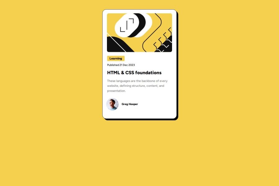
Blog Previe Card Using HTML and CSS
Design comparison
Solution retrospective
Your Feedback is Welcome
Community feedback
- @j0th4rPosted about 1 month ago
Hey, this looks awesome! The HTML is clean and semantic—nice job using proper headings and alt attributes. It’s responsive on small screens, and the layout feels solid with smooth hover effects. A couple of quick tweaks to make it even better: switch the <section> to an <article> for better semantics, and add an aria-label to the title link to boost accessibility. Using max-width instead of a fixed width will help with larger screens, and throwing in some CSS variables for things like #F4D04E will make future updates easier. Overall, you’re on the right track—just a few small changes to polish it up!
Marked as helpful1@Mahnoor366880Posted about 1 month ago@j0th4r Thank you so much! I really appreciate the feedback. I’ll definitely switch to <article> for better semantics and add the aria-label for accessibility. The max-width suggestion makes a lot of sense for larger screens, and I’ll look into using CSS variables to keep things more manageable. Thanks again for your insights—really helpful!✨
1
Please log in to post a comment
Log in with GitHubJoin our Discord community
Join thousands of Frontend Mentor community members taking the challenges, sharing resources, helping each other, and chatting about all things front-end!
Join our Discord
