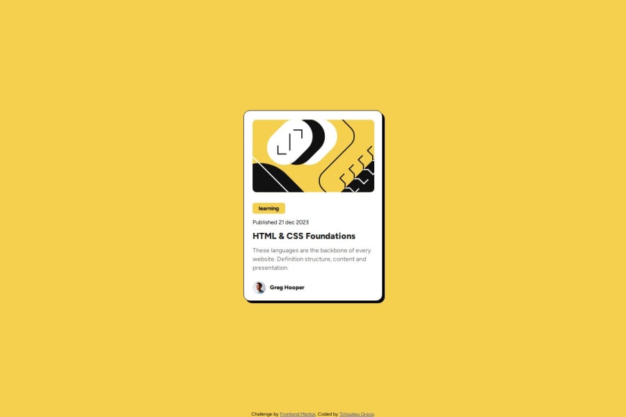
Design comparison
Solution retrospective
i am proud of all my css code
What challenges did you encounter, and how did you overcome them?I did not encounter any particular difficulty
What specific areas of your project would you like help with?I would just like to know if there is a way to make the css lines as small as possible
Community feedback
- @trayansh005Posted 7 months ago
Your solution is good but i do think it can be improve by adding line height for description and following the figma design file to have the exact width for the card. About CSS I don't think it can be any shorter but maybe someone more experienced has another solution about that. Good job tho
0
Please log in to post a comment
Log in with GitHubJoin our Discord community
Join thousands of Frontend Mentor community members taking the challenges, sharing resources, helping each other, and chatting about all things front-end!
Join our Discord
