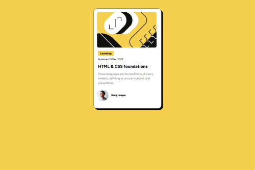
Submitted over 1 year agoA solution to the Blog preview card challenge
Blog-post with flexbox
@shpokas-io

Solution retrospective
What are you most proud of, and what would you do differently next time?
I am proud that i truly understood when to use flexbox, and got a bit of knowledge about media queries
What challenges did you encounter, and how did you overcome them?- The challenge was, where to use Flexbox, I chose only to use it on the image part, and the author
- How to make website design for mobile devices, for that I`ve learned media query technique
My biggest pain is that i still cant get a grasp of how to properly align items inside of content boxes, I think that I need to use flexbox everywhere, but when I use them it simply don't work, for this project I centered everything using margin side auto
Code
Loading...
Please log in to post a comment
Log in with GitHubCommunity feedback
No feedback yet. Be the first to give feedback on shpokas-io's solution.
Join our Discord community
Join thousands of Frontend Mentor community members taking the challenges, sharing resources, helping each other, and chatting about all things front-end!
Join our Discord