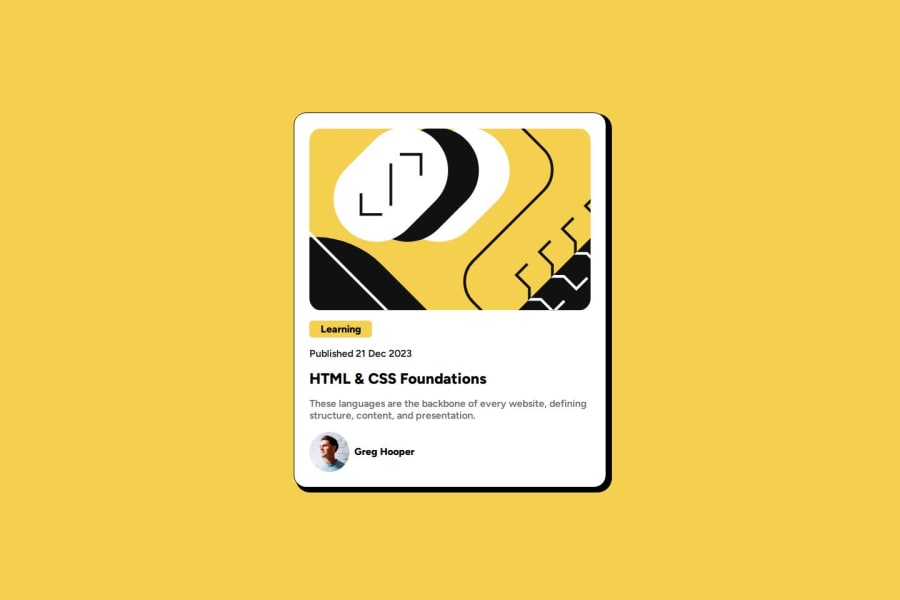
Design comparison
Solution retrospective
I finally understood that using scrolling helps manage the correct displaying of elements at smaller heights.
What challenges did you encounter, and how did you overcome them?I was struggling against a Safari margin default which I overcame using a CSS reset.
What specific areas of your project would you like help with?Why use line height at 150%?
Community feedback
- @hazhir00Posted 5 months ago
Hi, besides the card's width, there's nothing else I can mention. By the way, I looked at your source code and learned a lot from it. Thanks, and keep up the excellent work!
At the end, I had a question: Why did you place the CSS reset code in a separate file?
0
Please log in to post a comment
Log in with GitHubJoin our Discord community
Join thousands of Frontend Mentor community members taking the challenges, sharing resources, helping each other, and chatting about all things front-end!
Join our Discord
