Submitted 11 days ago
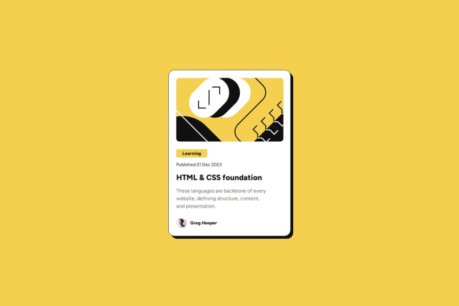
Blog Post Card with responsive design

P
@kjyothindrapavan

Design comparison
SolutionDesign

Solution retrospective
What are you most proud of, and what would you do differently next time?
I had chance to learn about css custom properties and handling images in css.
I think the css units should thought of more . I will use other units instead of pixels
What challenges did you encounter, and how did you overcome them?- Rounded corners for images: I have faced issue with rounded corners for images as image is not occupying entire height of parent. so i used
object-fit: covercss property to overcome it.
- suggestions on where css units can be modified.
Community feedback
- @Til-daPosted 11 days ago
- Yes, it uses semantic elements but the <section> tags inside the <article> could be replaced with more meaningful elements (<header>, <footer>). 2.Does the layout look good on a range of screen sizes? : YES, but some minor improvements needed like: The card scales well using max-width: 100% for images and content. It has a mobile-first design, with a media query (@media only screen and (min-width: 500px)). Possible Issue: The width is fixed (width: 327px; height: 501px;), which may not adapt well to all devices.
Marked as helpful0

Please log in to post a comment
Log in with GitHub
Join our Discord community
Join thousands of Frontend Mentor community members taking the challenges, sharing resources, helping each other, and chatting about all things front-end!
Join our Discord