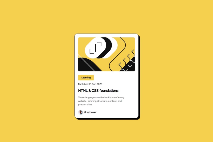
Design comparison
Solution retrospective
Used a bit of flexbox, still learning it alot. Hopefully able to dive more into it in the future modules.
What specific areas of your project would you like help with?CSS, I'm not really sure if I'm doing things too inefficient.
Community feedback
- @Zenith-pPosted 24 days ago
Great job! Your work is almost identical to the design, and it’s clear that you put a lot of effort into it. I have a few suggestions for slight adjustments to enhance it further:
Text Alignment: It would be great if the text could align more closely with the design specifications. Ensuring the text returns to the correct line when it should would help maintain the overall layout. Line Height: Adjusting the line height will improve readability and ensure it matches the design. Learning Box Size: The yellow box for "Learning" could be slightly larger to better align with the original design. Author Margin: Adding some top margin for the author section will help position it lower and improve the overall balance of the card. Card Centering: The card is a bit larger than expected and isn’t centered perfectly. Fine-tuning its size and position will enhance its visual appeal.
Your css code is fine your idea of using variables to avoid repetitions is good , also the @font-face, I will try to do the same next time.
Keep up the good work.
Marked as helpful0@jesse-kroonPosted 24 days ago@Fujin21 Thanks for the constructive feedback. Will definitely try and apply your suggestions, they're very helpful!
0
Please log in to post a comment
Log in with GitHubJoin our Discord community
Join thousands of Frontend Mentor community members taking the challenges, sharing resources, helping each other, and chatting about all things front-end!
Join our Discord