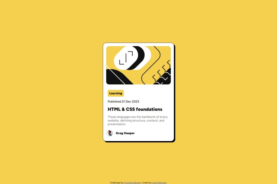
Design comparison
Solution retrospective
The overall responsiveness at smaller sizes.
What challenges did you encounter, and how did you overcome them?Again, mainly making the container respond to smaller sizes here. Getting the container to work in a desktop view didn't take long.
What specific areas of your project would you like help with?The challenge said it was possible to make text smaller without using media queries but I was unable to do this. I also had a lot of trouble scaling the image down and I'm not sure if the way I've done it is good practice. I also noticed that in the mobile design that the challenge gave that the image appears to be zoomed in but I was unable to achieve this effect. I also only used hover and not focus as the challenge listed as it was unclear where to use this.
Community feedback
- @R3ygoskiPosted 11 months ago
Hello again Lyle. First of all, I'd like to say congratulations! Your project looks almost similar to the proposed design, which is great.
Let me start by addressing your question. To create a small text without using @media, you can use
clamp(). This way, you can define a minimum, base, and maximum size for your text.The method you used to resize the image doesn't seem wrong, but instead of using
max-width, you could usewidth: 100%. This is because if the user happens to be using a larger font size, it may cause the image to appear small. To test this, try increasing your browser's font size, and then changemax-widthtowidth: 100%.Regarding the
::hover, you used it correctly; it was meant to be used on the card and the title. And a tip, the title should have acursor: pointer;because it's clickable.About the image zoom, you can add an
overflow: hiddento yourfigure, and on your image, addtransform: scale(105%), then just add theborder-radiusto thefigure.Once again, congratulations! If you have any questions or if any doubts arise, please ask below, and I'll try to help.
0@Squing0Posted 11 months agoThanks for your feedback! Clamp is pretty useful and you're right about the image width. Only thing I wasn't able to get working was the image zoom in effect.@R3ygoski
0 - @KerwinAngelesPosted 11 months ago
You need add more padding inside the card, after that look great
0
Please log in to post a comment
Log in with GitHubJoin our Discord community
Join thousands of Frontend Mentor community members taking the challenges, sharing resources, helping each other, and chatting about all things front-end!
Join our Discord
