

Design comparison

Solution retrospective
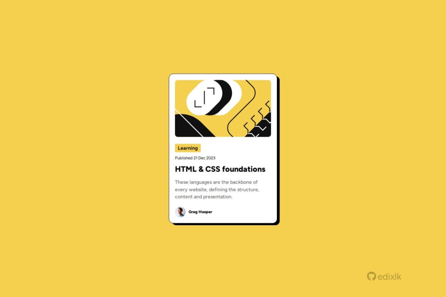
I have challenges with the "learning" text on the card. I set the background color and noticed that the header block element was stretched to 100% in the parent element. To fix this, I've set the the width to "object-fit" after tinkering around with it for a while.
Another challenge Iv'e also faced was with the user section which is the very lasy div at the bottom of the card. The text was not in line with the photo and the photo was a bit stretched out. By fixing this, I made the image width and height equal to avoid it from looking all stretched out and set the line height for the text depending on the width and height of the img tag which kept it in line with the img tag.
Community feedback
- @feelgoodddPosted 2 months ago
Your card profile class already has a display of flex and it's direction is row by default so you can remove flex-direction: row
To center them just use align-items: center and it should line up nicely without the line-height hack you used.
1

Please log in to post a comment
Log in with GitHubJoin our Discord community
Join thousands of Frontend Mentor community members taking the challenges, sharing resources, helping each other, and chatting about all things front-end!
Join our Discord