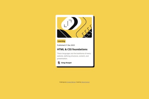
Solution retrospective
What are you most proud of, and what would you do differently next time?
I was able to get most of the spaces, gaps, margins, paddings as close as possible to the intended design file.
What challenges did you encounter, and how did you overcome them?This was a fairly easy challenge for me, as all the resources were provided.
What specific areas of your project would you like help with?I would like get help to include fonts in my projects that I further do
Code
Loading...
Please log in to post a comment
Log in with GitHubCommunity feedback
No feedback yet. Be the first to give feedback on vknir's solution.
Join our Discord community
Join thousands of Frontend Mentor community members taking the challenges, sharing resources, helping each other, and chatting about all things front-end!
Join our Discord