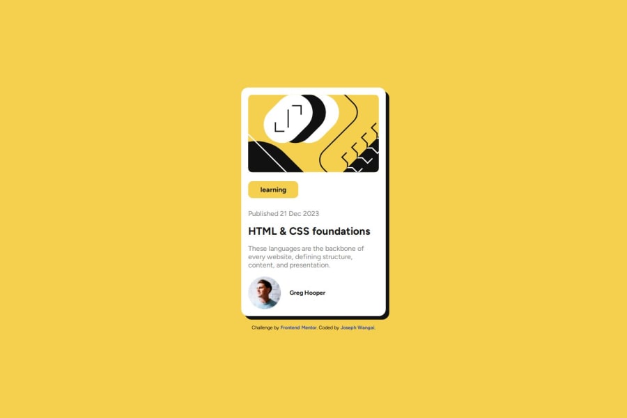
Design comparison
SolutionDesign
Solution retrospective
What are you most proud of, and what would you do differently next time?
Finishing the challenge
What specific areas of your project would you like help with?Keep the comments coming
Please log in to post a comment
Log in with GitHubCommunity feedback
- @cristi-20
Hello and great solution! I have a few suggestions that might improve your code and if you want you can check my solution to see what I am talking about.
- Use Semantic Html.
- Instead of using absolute units like px, use relative units like rem or em.
- Reset all your default styles by using the "*" star selector (you have an example in my css).
- Add a transition to make your hover effects smoother.
- Instead of centering your div to the page with flexbox which takes 4 properties center it with grid wich takes 2 properties. (Display:grid; Place-items:center;)
Join our Discord community
Join thousands of Frontend Mentor community members taking the challenges, sharing resources, helping each other, and chatting about all things front-end!
Join our Discord
