Solution retrospective
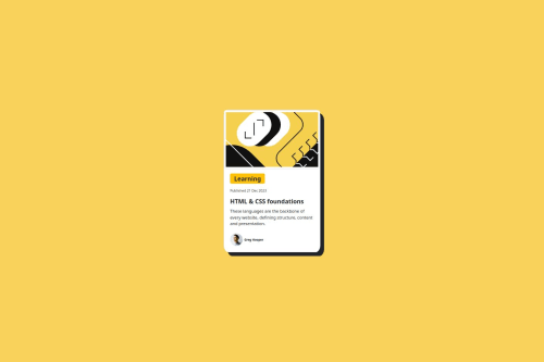
I am proud that I made the application device-responsive friendly in some devices, with help of bootstrap framework, which helps in writing less CSS, which would help me not spending much time on writing basic CSS for styling and designing basic components, where I could focus on other parts of CSS like media query and working on to make application more device-responsive friendly, Next time i want to make application more responsive and work on all devices according to the width dimension.
What challenges did you encounter, and how did you overcome them?I couldn’t understand the basics of media query and making the application device-responsive friendly, I over came the challenges by watching some videos and reading some blogs related to responsive web pages and making it little bit responsive, and works perfectly on some devices not on all.
What specific areas of your project would you like help with?I would like help with more on media query how to use it? where all I can use it? and how to make application responsive friendly on other devices like tablets and mobile, and user-friendly, also I need help on making application responsiveness Tablet and Mobile friendly.
Please log in to post a comment
Log in with GitHubCommunity feedback
No feedback yet. Be the first to give feedback on Sourabh Dg's solution.
Join our Discord community
Join thousands of Frontend Mentor community members taking the challenges, sharing resources, helping each other, and chatting about all things front-end!
Join our Discord