Design comparison
SolutionDesign
Solution retrospective
What are you most proud of, and what would you do differently next time?
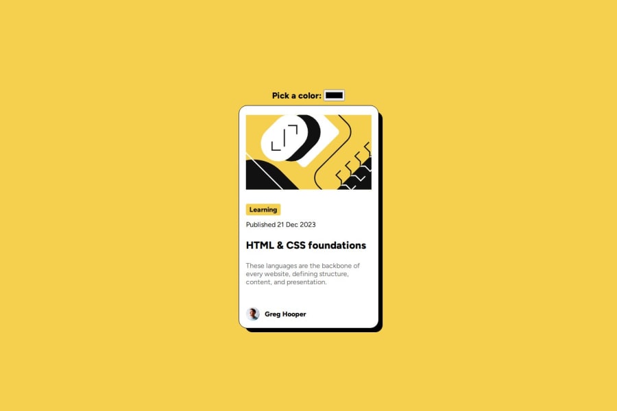
I'm proud to have added extra funcionality (change theme). Next time I'd like to put more effort into responsive desing.
What challenges did you encounter, and how did you overcome them?I wasn't be able to add border-radius to the svg image with javascript, I searched many ways but none of theme works.
What specific areas of your project would you like help with?I can't change the border-radius with javascript. I found it difficult to work with the responsive design of the card.
Community feedback
Please log in to post a comment
Log in with GitHubJoin our Discord community
Join thousands of Frontend Mentor community members taking the challenges, sharing resources, helping each other, and chatting about all things front-end!
Join our Discord
