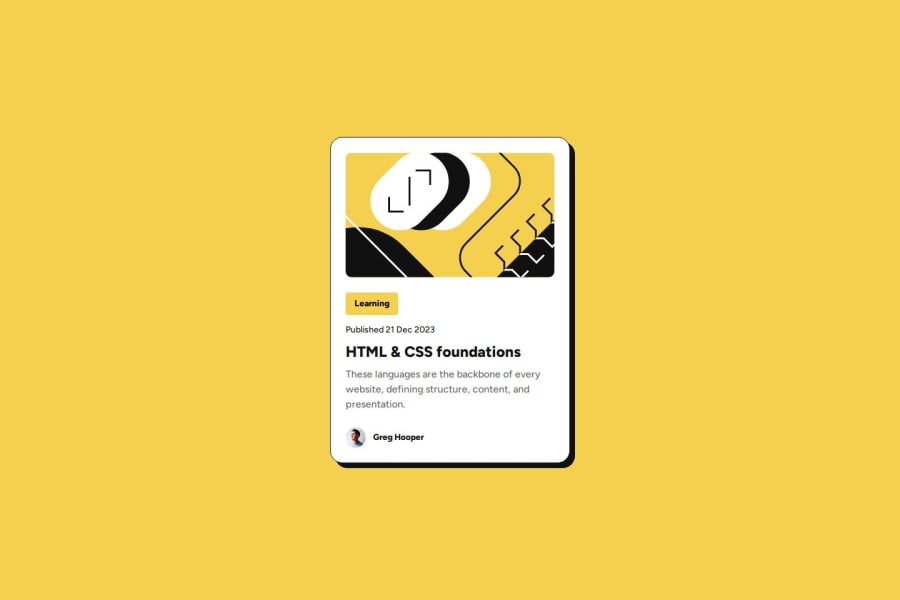
Blog Card with responsive font-size (no media queries) & a small twist


Design comparison

Solution retrospective
Initially, it didn't look like a lot, but taking with a serious approach, I found a lot of learning from this. Also, remaining accountable and showing up is good stuff.
What challenges did you encounter, and how did you overcome them?First I didn't even know it was possible to host your own fonts. Then, as well, I learned about the advantages of using variable fonts (hosting them yourself!). From both of these things I research, tested and learned a lot. But mostly the proposal of the challenge to make font size responsive without media queries was great. There I had some interesting learning. Had to research quite a bit. Left some resources in the README. Also, I added a small supplementary twist (don't want to spoil it here), and in doing so, I also had a nice opportunity for learning.
What specific areas of your project would you like help with?I know I have to be as specific as possible here. The thing is I spent quite some time researching and testing to build this one, so I don't have a lot of specific doubts. However, what I would appreciate, and especially so if you have more experience, is if you find anything (yeah, anything!) that I could work on and do some research and testing to get better at, or even things that I might have completely ignored, completely oblivious, that you could briefly point them out to me. Will be a lot of help and takes just a minute. Thank you!
Community feedback
Please log in to post a comment
Log in with GitHub
Join our Discord community
Join thousands of Frontend Mentor community members taking the challenges, sharing resources, helping each other, and chatting about all things front-end!
Join our Discord