Design comparison
SolutionDesign
Solution retrospective
What are you most proud of, and what would you do differently next time?
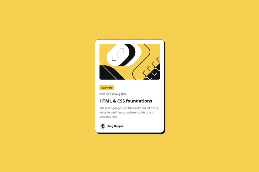
Happy that I made it look almost like the original one.
- took less time than the previous one
- Did all by myself
Things I would like to improve:
- Use of unnecessary margins
- Unprofessional work/Bad Practices
There was not much of any challenge, everything went smoothly. Used flex to align all the items
What specific areas of your project would you like help with?Okay, so I did this without any help (like chat GPT, google, stack overflow, etc) I am pretty sure that I did some unnecessary things.
And did some Bad practices
I would really appreciate anyone pointing out the mistakes/bad practices that I did. And would greatly benefit from any suggestions to make the code DRY
Community feedback
Please log in to post a comment
Log in with GitHubJoin our Discord community
Join thousands of Frontend Mentor community members taking the challenges, sharing resources, helping each other, and chatting about all things front-end!
Join our Discord
